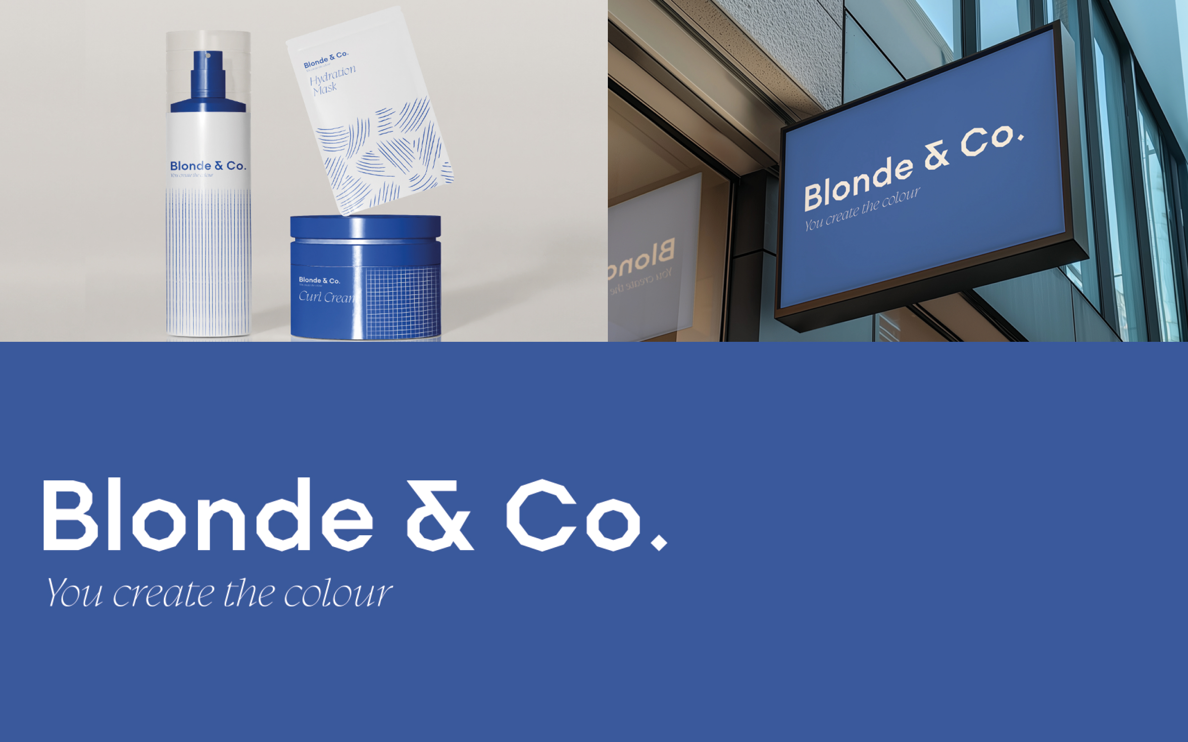
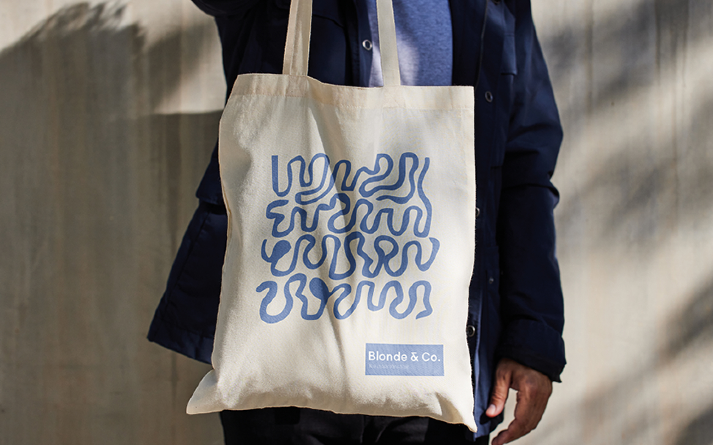
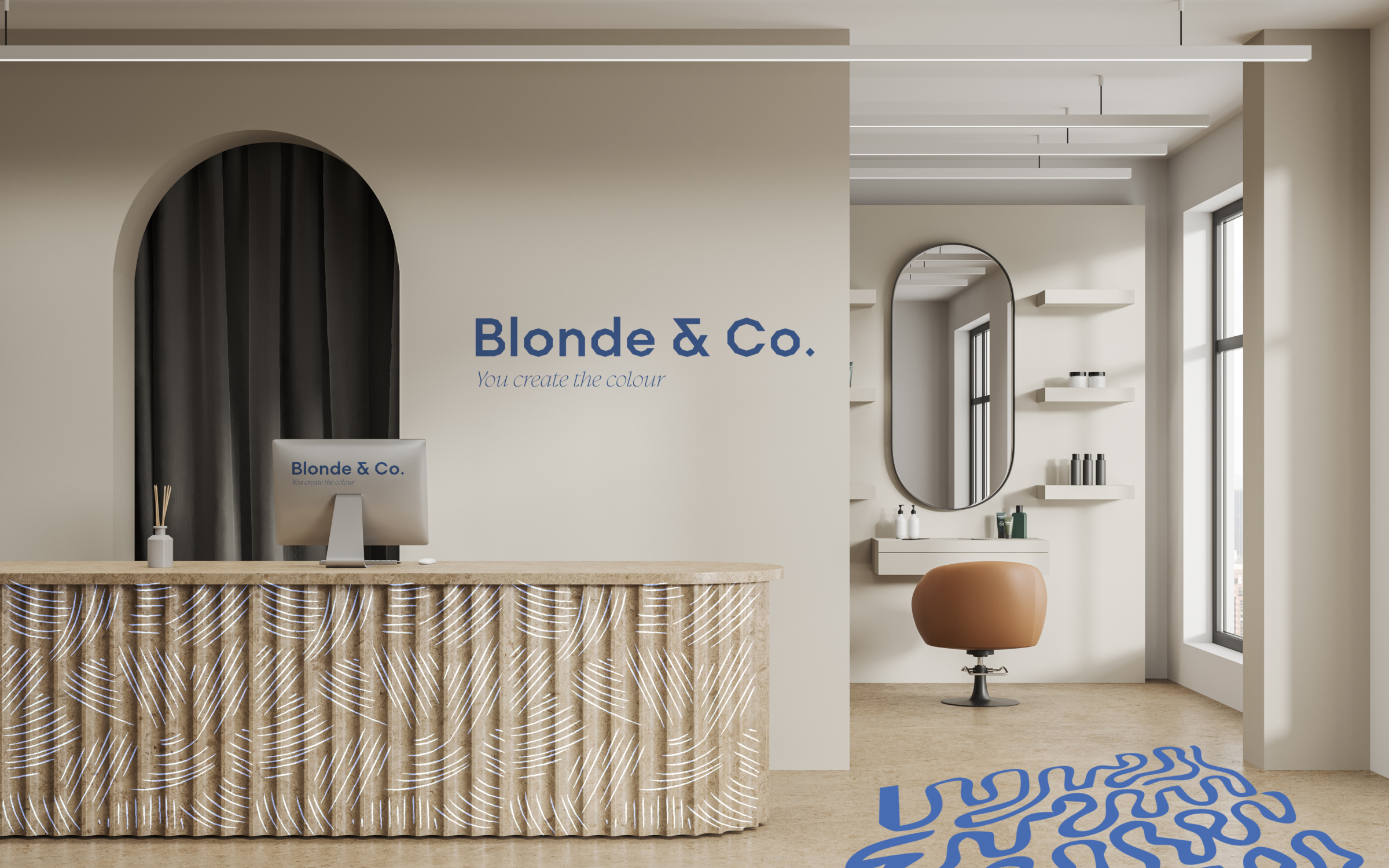
WEBSITE
Our goal was to weave nostalgia with a modern, clean, and dynamic design. The new logo needed to scale effortlessly—from staff shirts to rollercoasters, merch, and even the sides of their iconic buildings. Drawing inspiration from their previous logo, we reimagined the iconic star, incorporating it into the negative space of the "5" in the wordmark—a subtle nod to their parent company, Five Star Parks. The extended star point symbolizes speed and motion, reflecting the energy and thrill of Scene75's attractions. The final visual identity showcases bold typography, energetic design elements, and custom iconography that represents the park’s attractions. Paired with adaptable layout templates, this system empowers their team to roll out future marketing campaigns with ease.
PROJECT
Hair Salon Branding